Tuesday, October 21, 2008

Overall Reflection~

From these three workshops I had during the semester i gained valuable experience and knowledge.  Each workshops objectives and goals for the students were all very different and although each focused on very separate topics, by combining all knowledge gained a very successful presentation piece can be produced.  

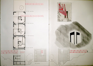
For each workshop I tried to incorporate what I had learnt in previous workshops to create a more interesting piece.  For example in the second workshop I used red as the only colour in my final presentation which shows the importance of the bridge and that part of the building.  In the third workshop I used the experiences I had in the architectural drawing workshop to spread out and in a way quickly plan how my drawing would look on the page which made sure I didnt cramp myself into one corner or just in the centre of the page.  

After reflecting on all three workshops I still believe the Fluid thoughts to action workshop helped me gain the most confidence in my work.  At the beginning of the workshop I was frightened to start a drawing especially on a such a large piece of paper (A2).  However, by the end of the workshop I was able to easily put charcoal to paper and draw.  
The Atlas of Colour workshop was also very important as it really opened my eyes to the range of bold colours used in the built environment and that not all presentations have to be plain and minimal in information, images and colour.  

In all three workshops time management was also a key factor.  Although it seemed at times that the workload was quite a lot it helped me to become more decisive faster and have more confidence.  I no longer had the privilege to think things over a long span of time (especially in in-class exercises) but rather what I thought would look good and how I wanted to convey an idea or space in the most successful way but also within a time limit.  

All three workshops I undertook in this subject really broadened my ideas on how information can be presented and communicated to  colleagues and clients.  This knew knowledge will not only help me in my future studies but also in my career in the future as a architect. 

Workshop Three: Fluid Thoughts to Action~

All drawings done during the workshop.
In class Group collaboration.  A column was used as the central focus of the drawing with other drawings cut up creating a mosaic effect for the ceiling and walls.  
Completed Folio.
First drawing of opera house showing motion.
Second drawing of the opera house. I really wanted to show how this building whilst being very elegant can also be seen as dominating and monumental.
In class still-life drawing. 
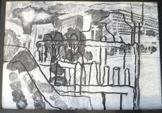
In class drawing of landscape and detailing from level 6 window. This drawing was probably the hardest for me to draw during the course.  Usually when I draw I tend to draw as realistic as I can however with such a large landscape and limited time I used mainly tones and shading to create the landscape.  The detail which was drawn on top was also very hard for me as I had to completely relax and let my observations guide my hand.  Although the detail does not convey complete comfort and confidence it contrasts with my usual drawings.
Product from a Verbal description of a space. 
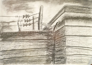
Exterior drawings. This first drawing allowed me to experiment with layering similar to the the in-class landscape exercise. I drew a landscape based on tones and layered the fencing over the drawing and also brought the fencing closer to the viewer.
Through my drawings I experimented with the two types of charcoal we were to use, willow and compressed.  They each gave a different effect and texture to the drawing and i tried to incorporate these textures and tones into my drawings.

Interior Drawings. This was one of my first drawings and as you can see it is very tentative and unsure in the tones and linework.


I also tried playing with light and showing the movements of light over time.
Exterior Drawings.
In these drawings I used both types of charcoal to differentiate the man made objects with the natural plantation of the space. The willow charcoal also gave me more room to express myself through the drawings.


These two drawings show how i experiment with different drawing styles.  In the drawing below I used a more simple approach by only showing the basic shapes which make up the apartments


Exterior Space.

In these powerline drawings I used compressed charcoal to emphasise the harsh nature of the space and structure.


Interior Space


Overall, from the experience of all three workshops this workshop was the one I enjoyed the most.  Although at times the amount of drawings we had to do seemed overwhelming it was still a very enjoyable experience.  I tended to draw many drawings in one go rather than the suggested two a day at different times.  I felt that by doing this I was able to let myself relax and develop my confidence in my drawings by continuously drawing rather than stopping and starting.  This allowed me to progress further and build confidence in this new medium.  The most important lessons I took from this workshop are to experiment with different mediums, how to convey a space through drawings and how to create more fluidity in my drawings which creates atmosphere.  Using different mediums allows for more possibilities in presentation and fluidity in the drawings gives a sense of atmosphere in the space being drawn and makes the entire drawing more expressive and interesting.

Thursday, October 2, 2008

Workshop Two: Drawing~

Tea cup exercise#1
Drawing Perspective drawings
Putting the building we're studying into a different context.
Final layout and presentation

The most important lesson I learnt from this workshop is how to lay out a page and how to be selective with what you want to put into your presentation.  Although I do like the tightness of the plans forming the vertical forms of the building it is a bit too cramped.  I learnt that whilst information is important (which is shown in the way I tried to fit as many plans as I could into the drawing) it is important to be selective with what you show, for example I could've left out a plan and spread the rest more which would still suggest the vertical elements of the building but also gives more space to the presentation.

Wednesday, October 1, 2008

Workshop One: Atlas of Colour~

Final product 
I decided to bind my book in Accordion Fold Style because I wanted to bind a book in a more interesting and unique way.  By taking advantage of this workshop to practice and experiment with different book binding methods i was able to become more familiar with different techniques and was able to produce a book which, when stretched out completely, showed the sequence of events and exercises which helped us understand the importance of colour in the built environment.
Title page: my ideal colour was Yellow Pantone 108
For in class notes I had a very simple layout where I used layering to create a interesting effect.  I retyped sheets given to us in class and blurred and made it more transparent and then hand wrote notes I took in class over the top. 
Close up of in class notes
Colours I surround myself with
Watercolour drawing of colours working in harmony in the Built Environment

One interesting part of my Atlas would be my painting of a stained glass window in St. Mary's Cathedral.  I decided to do the painting on a piece of transparency which allowed the viewer to have a idea of what it was like actually looking at the window. However the paint I used began to crack after I had secured another transparency over the top leaving it quite fragile.


I really enjoyed this workshop as I really like colours and how it can affect people and the symbolisms it has in different cultures, traditions and lifestyles.  This workshop was really successful in the way students were able to experiment and test their own creativity and workmanship.  By doing watercolour drawings of buildings it really opened my eyes to the range of colours used in the built environment. People usually look at the building as form, structure and design and forget how important colour is to create a atmosphere upon entering a building and the symbolisms it has in different cultures.   From this workshop i've come to realise how much difference can be made in a building by the simple step of changing the colour of the building and this is something I will continue to use and investigate during my studies.  Overall this workshop was really enjoyable as it allowed me to combine my love for colour with a very hands-on project.